|
The art criticism process first starts with describing the artwork, then to analyze the artwork, then interpreting the artwork, and finally judging the artwork. I am critiquing my 2 in 1 piece. The artwork is a city skyline incorporated into a key. The shadows are shown through stippling, and the piece is on a black piece of paper. The piece’s overall composition focuses more on the key and the shadows between the buildings. The overall feeling of the piece is almost whimsical in a way that the lines and the skyline focus on a different take on everyday things. The artwork overall has relatively clean lines, however the black paper background makes the stippling seem too light. More stippling should have been used to ensure that the more prominent lines have more value. 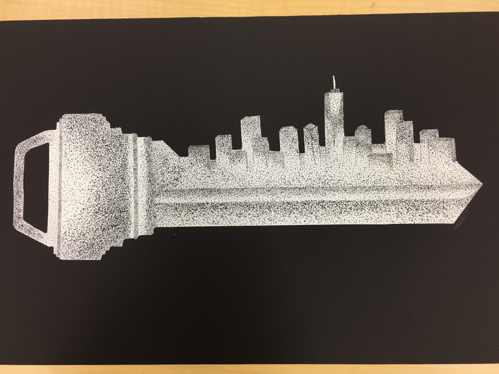 Question #8- I learned most from the sign language alphabet warm ups. With each new letter I was able to focus more on the shadows and lines that are on my hand. I notice progress throughout the letters. 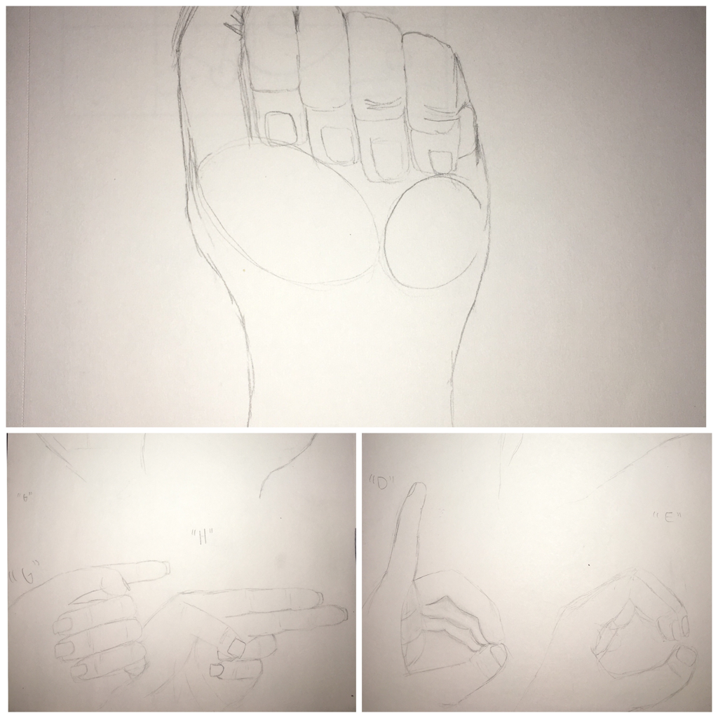 Question #11- Although I haven’t finished the portait piece, I feel that this piece of my sister reflects me as an artist. Watercolor was one of my favorite mediums to work with and the bouquet in the picture works as a focal point of the piece. I chose to paint my sister because of the connection I have with her. She is very talented with art and her connection with art and our bond as sisters inspired me to paint her. 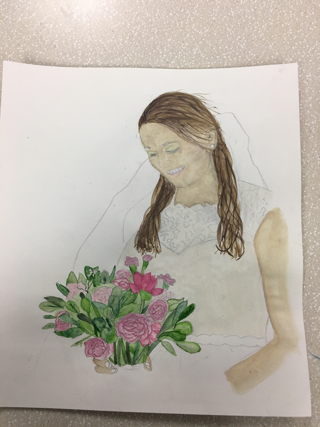 Question #9- Having the illustration Friday’s every week allowed me to brainstorm different ideas on a topic and helped me discover what mediums work best for me. They also helped me take my ideas and put it on paper. With each illustration Friday I tried to use different mediums to express the word of the week. My most recent illustration Friday was map and I used watercolor. I think using different mediums allows for an expansion of skills. 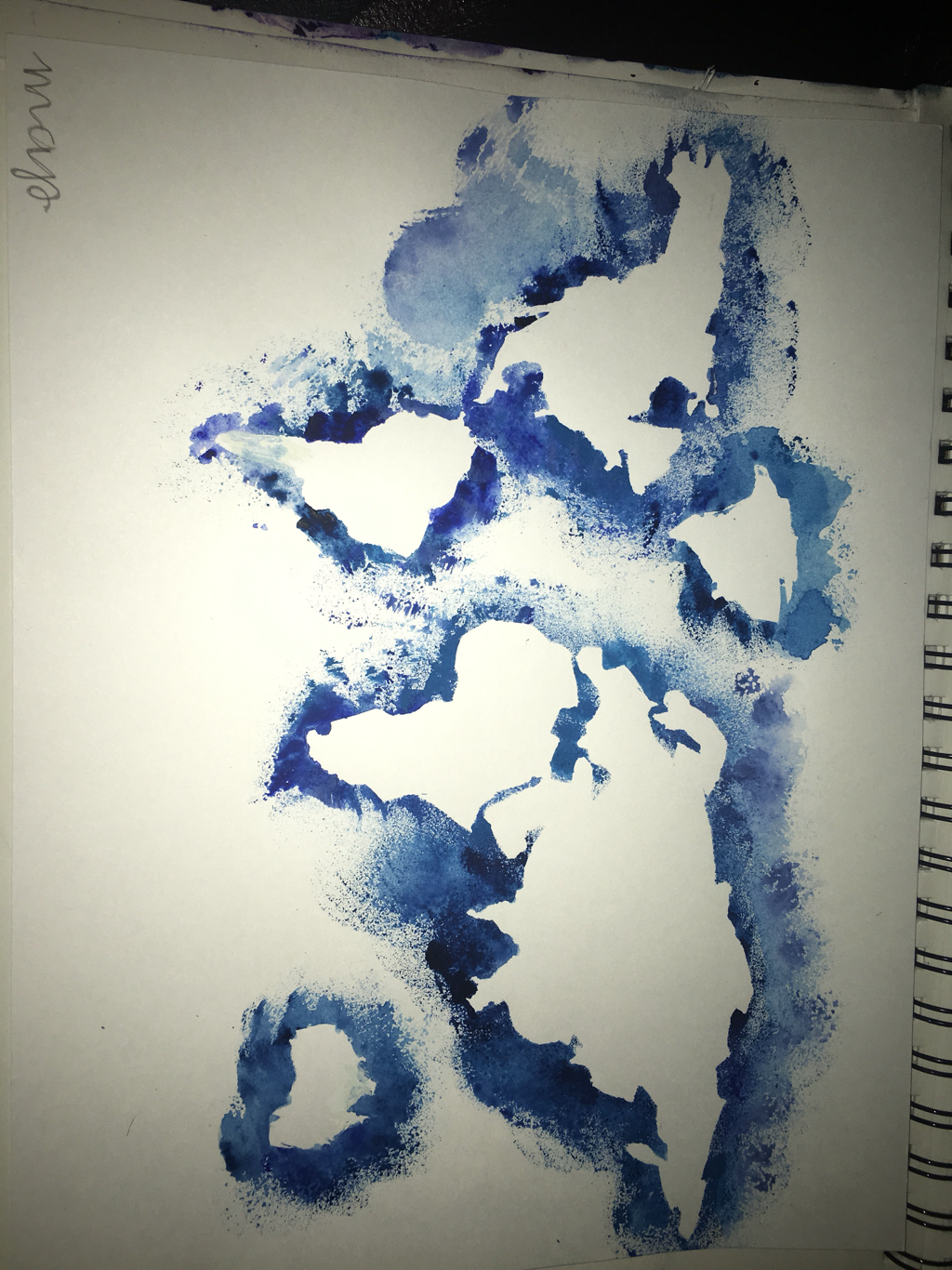 This watercolor illustration Friday prepped me for my portait piece.
0 Comments
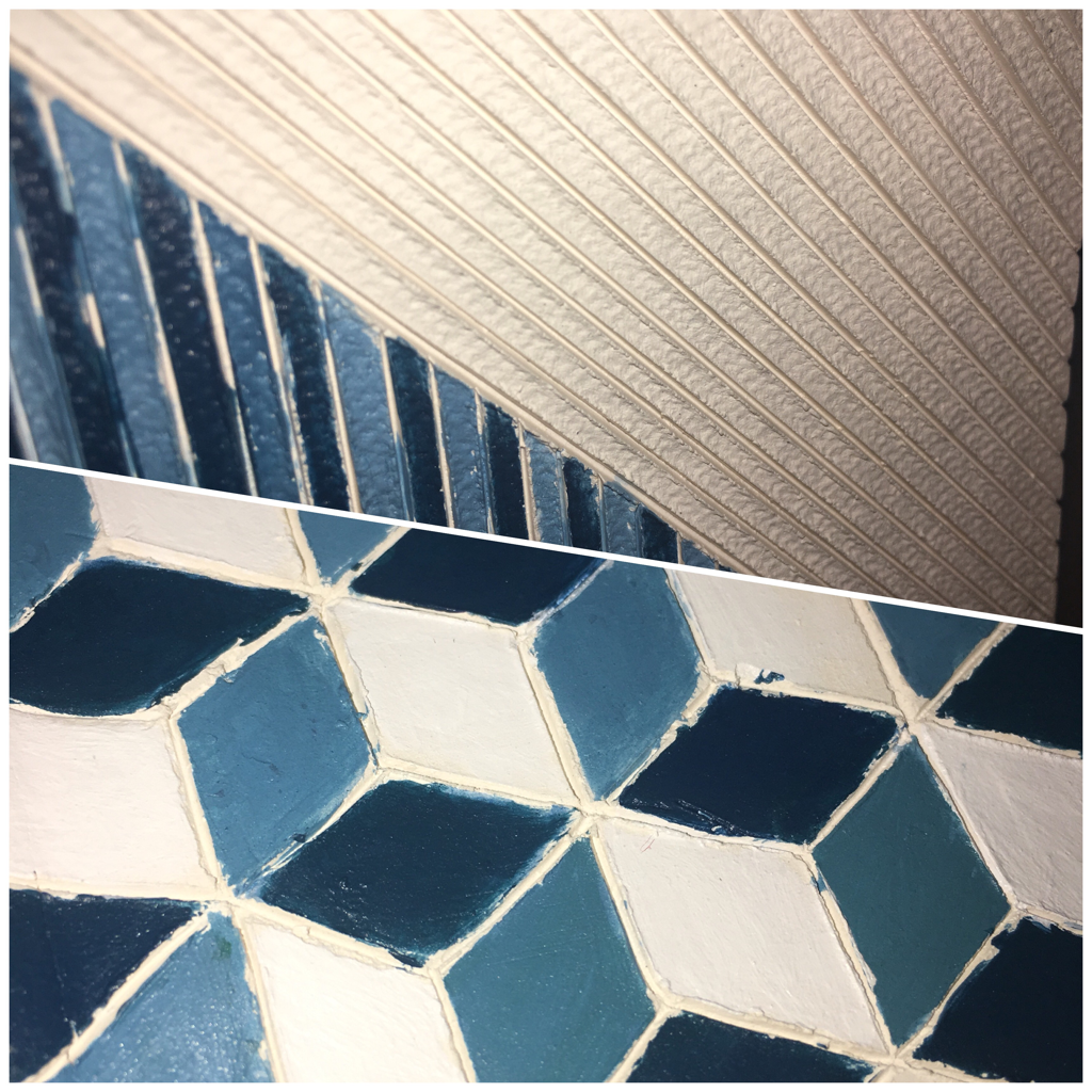
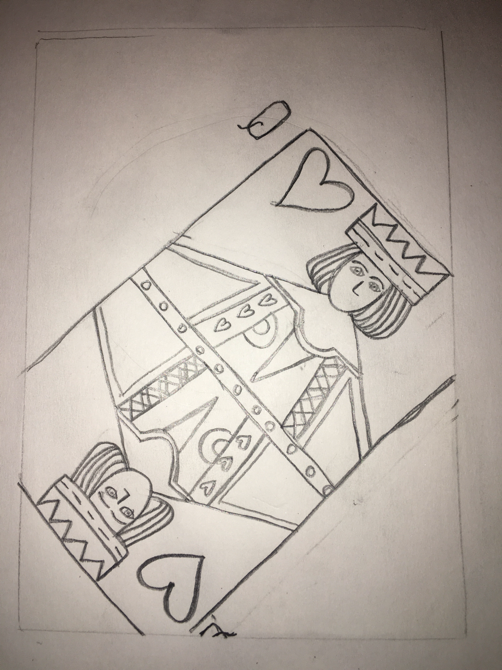 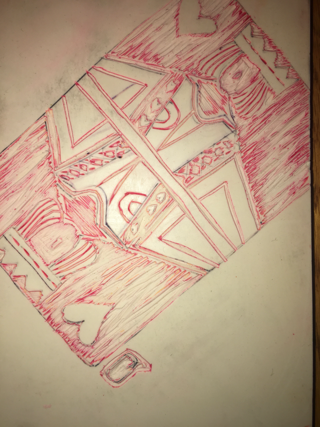 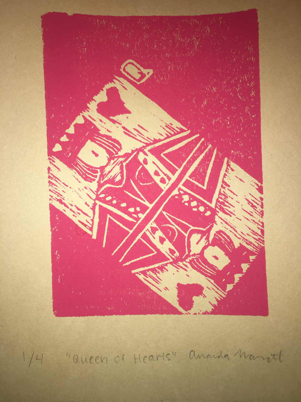 My piece displayed the theme of line because a card has prominent lines and I think that showing the other lines behind the queen displays the theme “line.” I think the design was successful in that I had clean lines throughout the entirety of the piece. If I were to do the piece again I would do it larger. I felt that the piece didn’t fully utilize the whole linoleum block. Also re-doing it larger would allow for the smaller details to look better/ more recognizable.
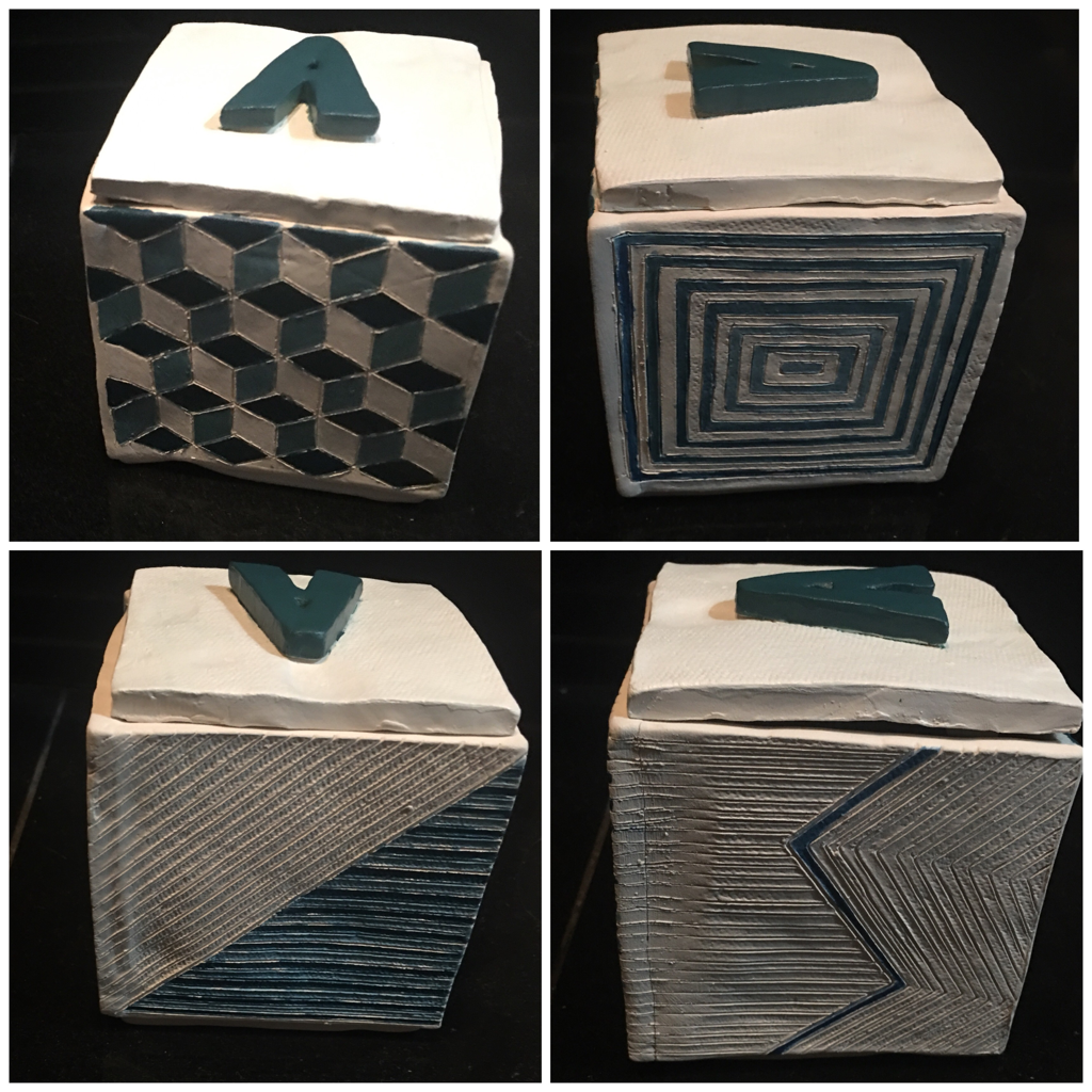  The first picture posted is the finished piece after it was fired and painted. The second picture is the detailed shots of my favorite sides of the final piece. I found that my lines were clean and that made my piece successful. If I were to do the piece again, I would focus on getting cleaner lines with the paint.
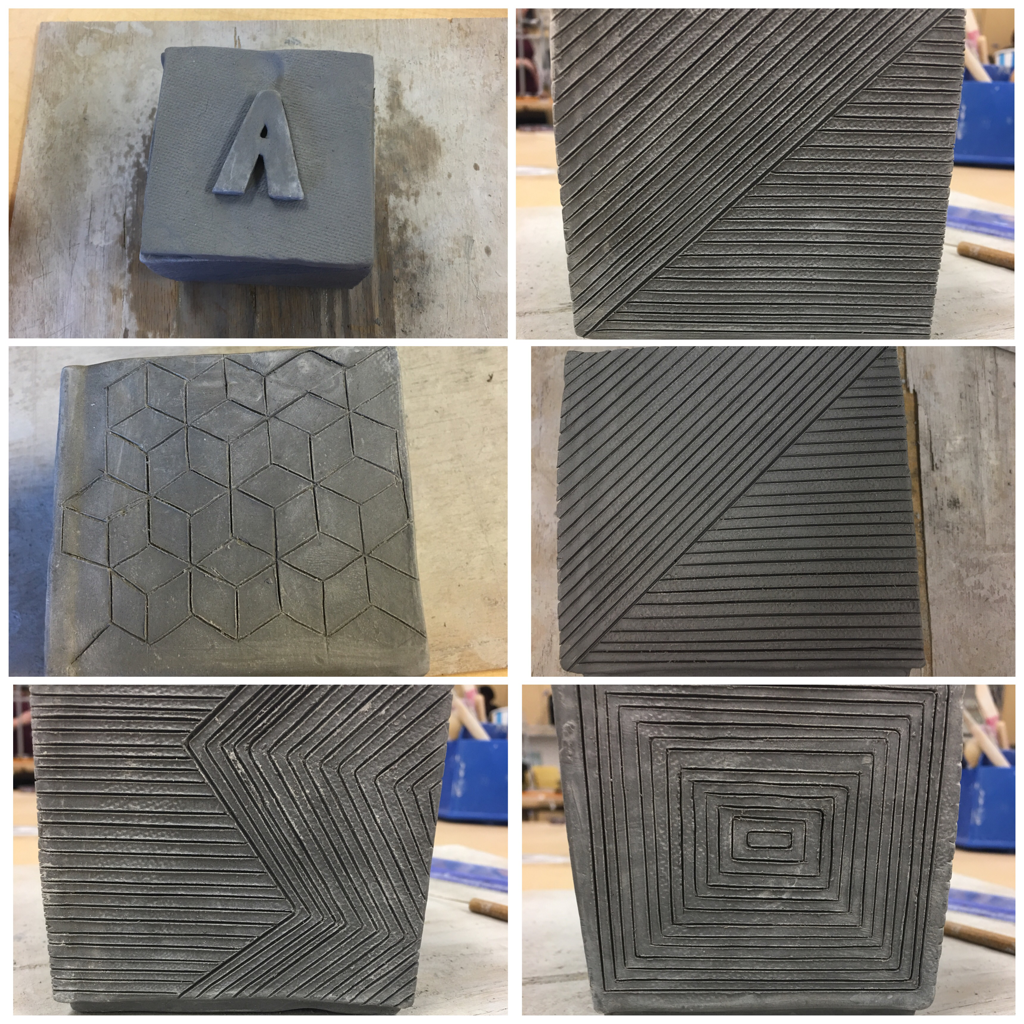 For this piece I plan to paint it with teal and white paints. I plan to keep parts of the piece blank so that it allows the teal to be the main focus on each of the patterns. My goal for this piece was to have each of the patterns have a focal point so I hope for the paint to display that. I have found that my box pattern was the most difficult. It was difficult because trying to get the lines straight but still show the pattern. I have found that the other straight line patterns as well as assembling the box was successful. For making the box itself I measured out the flattened clay and took each slab and used the scratch and slip technique. This technique allows for bonding of the slabs so they don’t fall apart when being fired. The picture posted above is the greenware (unfired pottery) I plan to paint after it has been fired (bisqueware).
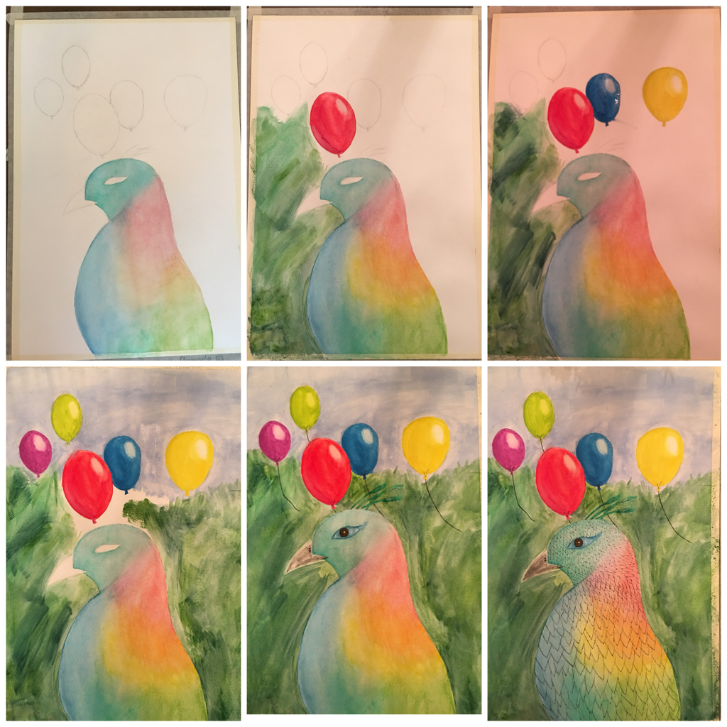 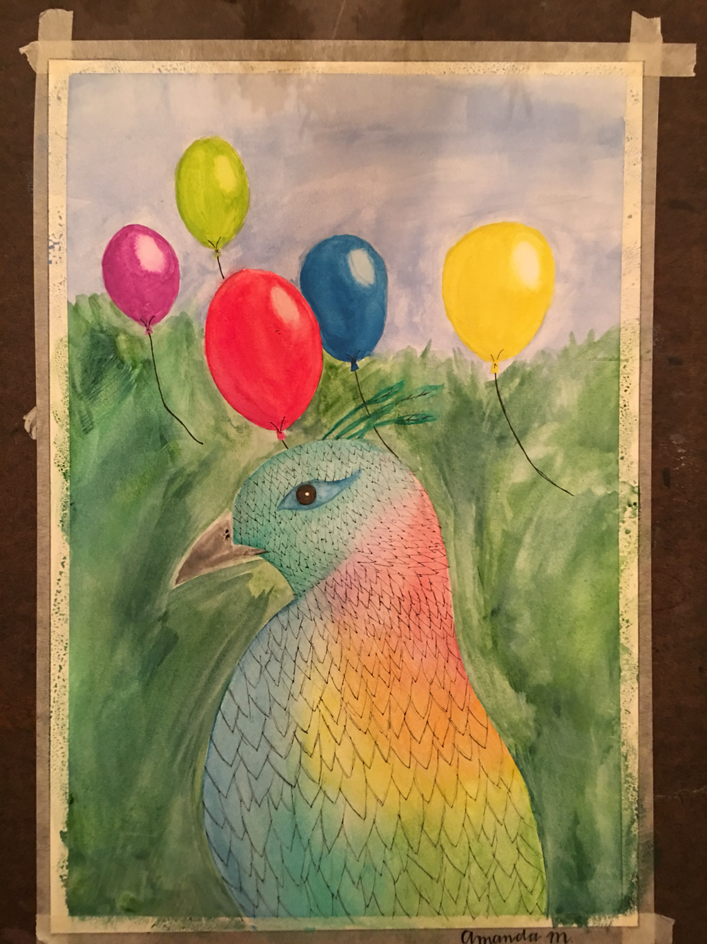 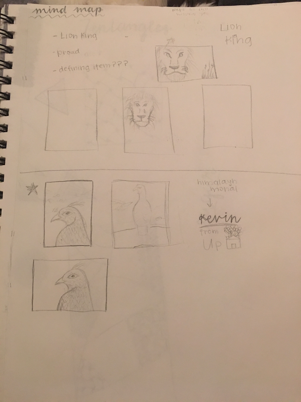  For this project, I recreated the character Kevin from the movie Up. I decided to look up what animal the creators of the movie based Kevin off of. I included the balloons from the movie which is a defining element from the movie. My piece is different from others because I focused on a more “realistic” version of the character. I used the water color by building the layers on the feathers of the bird. I would recommend to others to be patient and allow the layers to dry to build stronger and bolder colors.
For me the most helpful warm-up was hue value scale because it allowed me to focus on the blending of colors which my piece have a lot of. In this project I represented my favorite beach. This place is special to me because it represents the peacefulness and serenity that can be found in nature. It is also important to me because I have fond memories of vacations with my family at this beach. For me the most challenging thing, was capturing the texture in the wood of the boardwalk. However, I felt that the sunset as well as the grass for the most successful parts of my piece. This project took me a lot of patience for me as I tested out different colors of brown that I wanted to use for the word as well as blending the sky to the right colors that matched my picture. 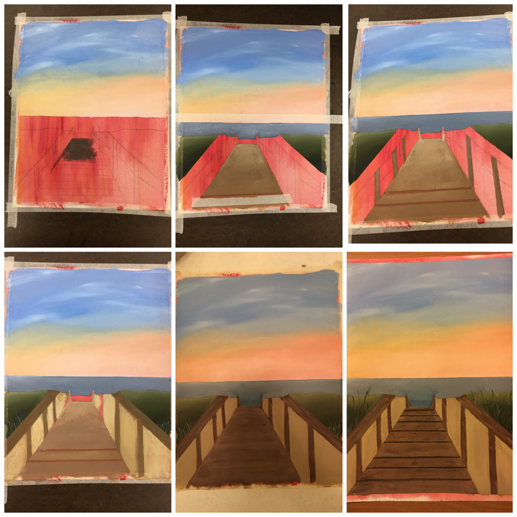 The picture above shows my piece at six different stages of where I was testing out the different shades of the sky as well as the shades of the boardwalk that I wanted to use.
This warm up helped me learn about mixing different primary colors to make the secondary colors. Each of the colors mixed with different proportions produces a different shade of the color. There are multiple ways to make brown. First way is the primary colors mixed together, the second is orange and blue, and the third is purple and blue. 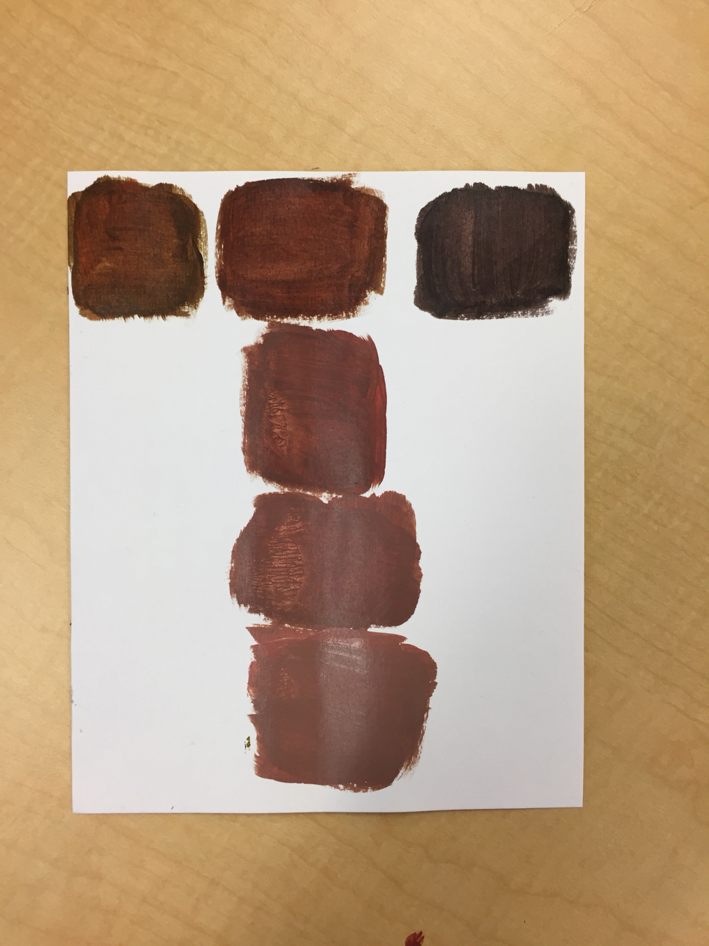 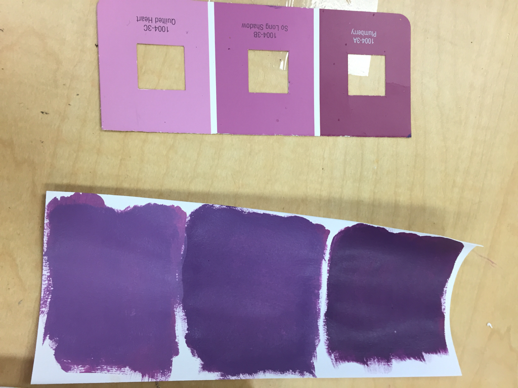 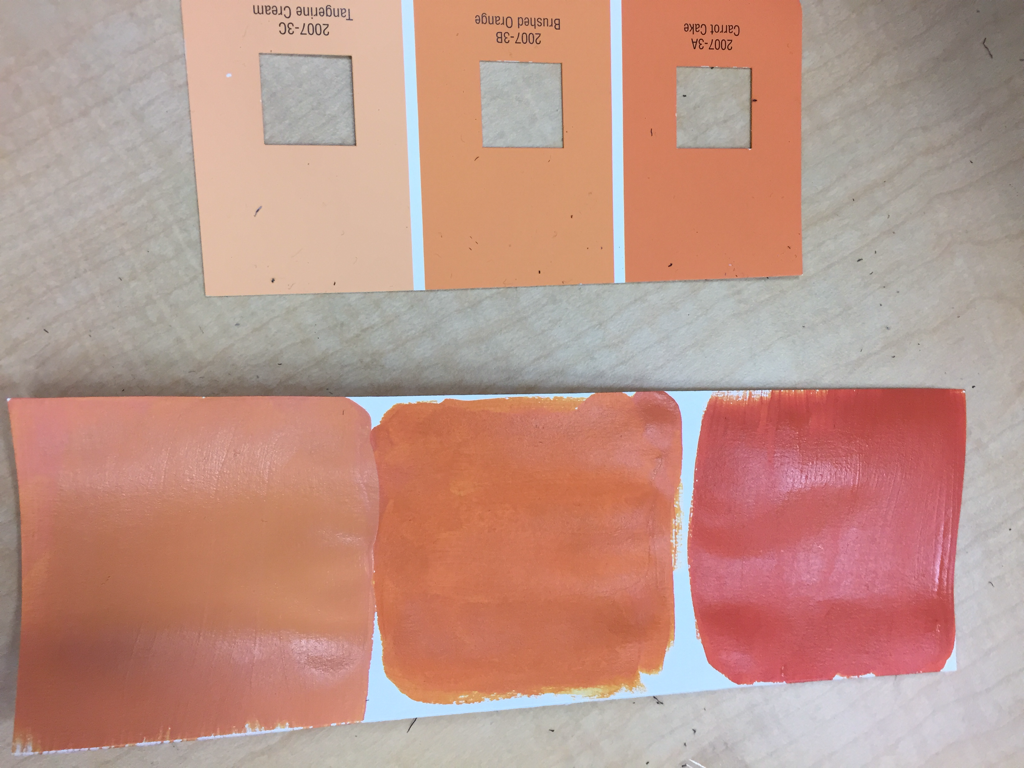 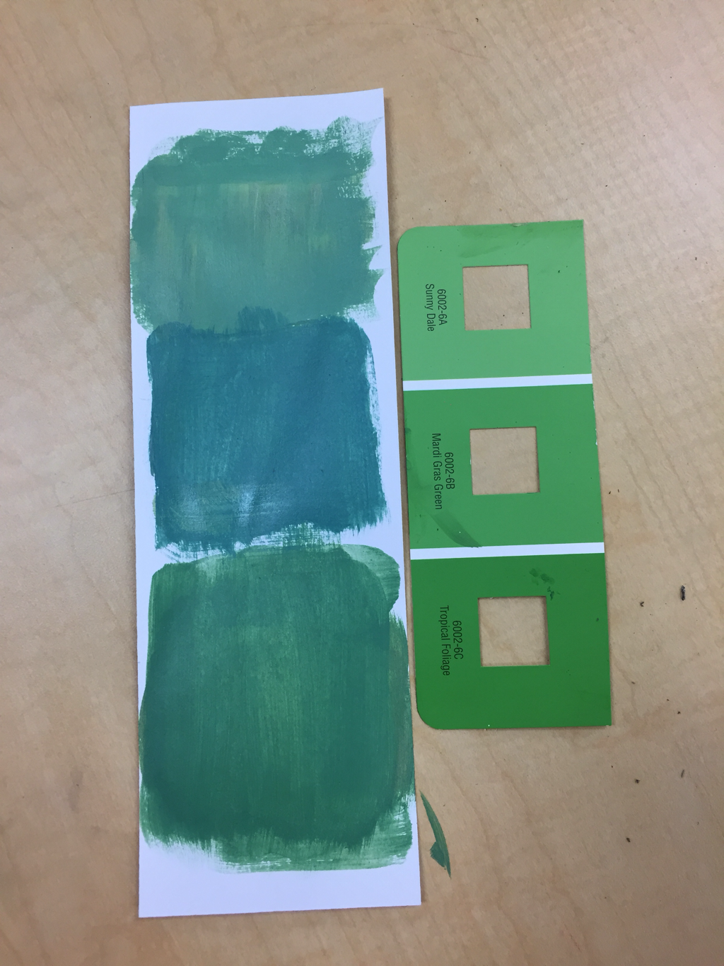 My AP art mentor was Kara. She enjoys doing acrylic wash. Acrylic wash is a mix between watercolor and paint. Although it is time consuming she said it allows for a better build up of color. Kara gave my partner and I advice about stuff in our sketchbooks, and about our basic sketching. Her link is art4kara.weebly.com
I think that if I take into consideration the advice that Kara gave me, it can make my pieces stronger. I want to be able to improve my pieces and make them better, rather than having a weak piece. The most helpful warm up for me was the value scale and the spheres because working in vetting a nautral transition between the different pencils helped with the pencil drawing. And the spheres helped me work on blending out my work and getting the correct highlight and shadows. Composition is the placement or arrangement of visual elements in a work of art. Value is the element of design that defines the lights and darks in artwork. A pro of using pens as a medium is it is able to capture more nautral shadows and more depth. A con of pens, is it is permanent and can't be erased. Using charcoal is a pro because it is easily erased. A downside to charcoal is it can be messier and reblending the darker charcoal is harder. A plus side to using pencil as a medium, is that it can be erased and blends well, however it can sometimes be harder to get the fine details. 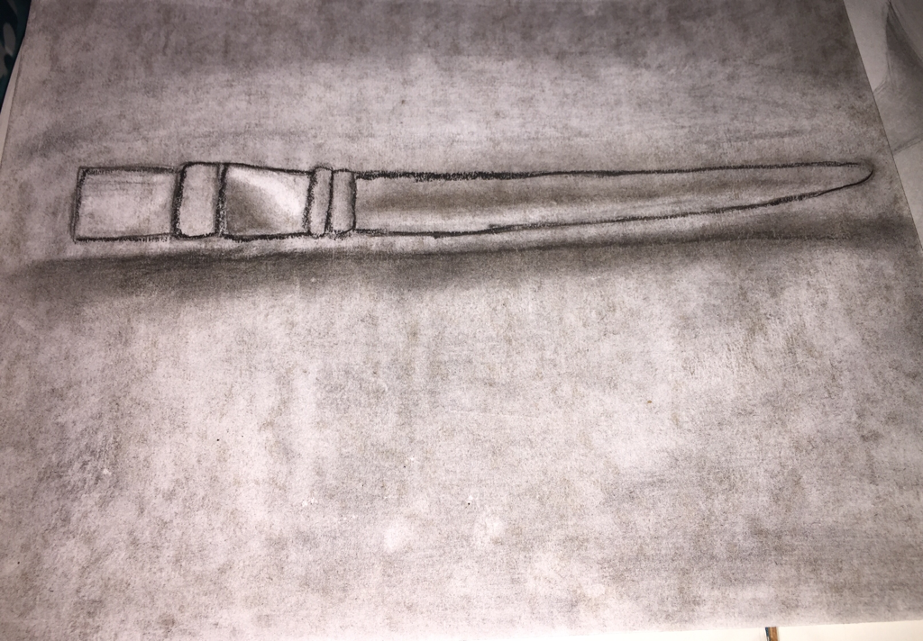 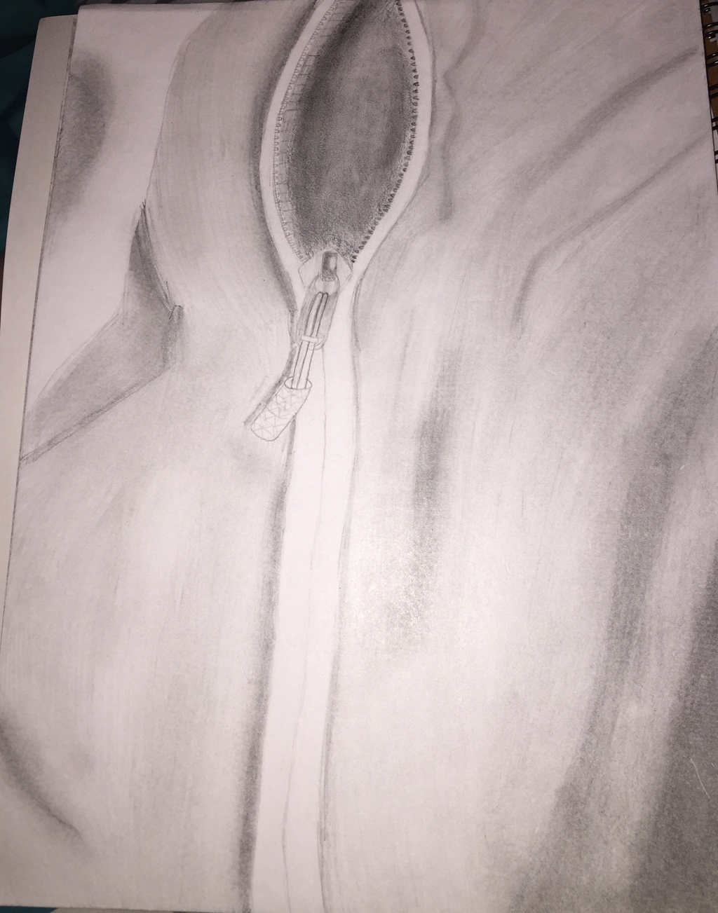 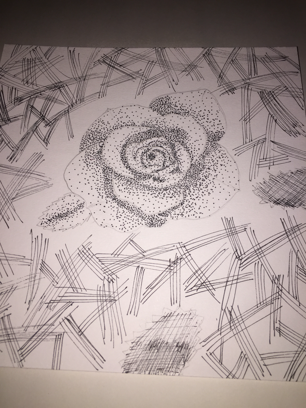 |
 RSS Feed
